Grantmaking
Redesign of the primary business offering for foundations by Fluxx.
Foundations have unique missions, review cycles, reporting requirements, workflows, and teams. The platform I worked on was built for these customers along with the grantees, researchers, reviewers, and consultants associated with them. Moreso than staying organized, grant makers are seeking to understand the impact their contributions are having while learning ways to replicate success in the future. My contributions to this product began with updating the interface we offered to program officers, grants managers, and reviewers. Over time we moved into more use cases for executives, high-volume teams, and extended program areas. As our lead designer, the responsibility was wide-ranging and moved at a fast pace of iteration and delivery.
Card-based Considerations
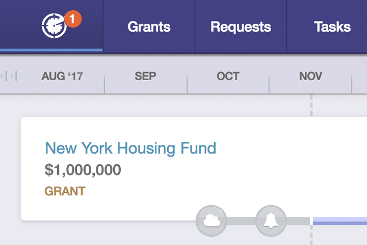
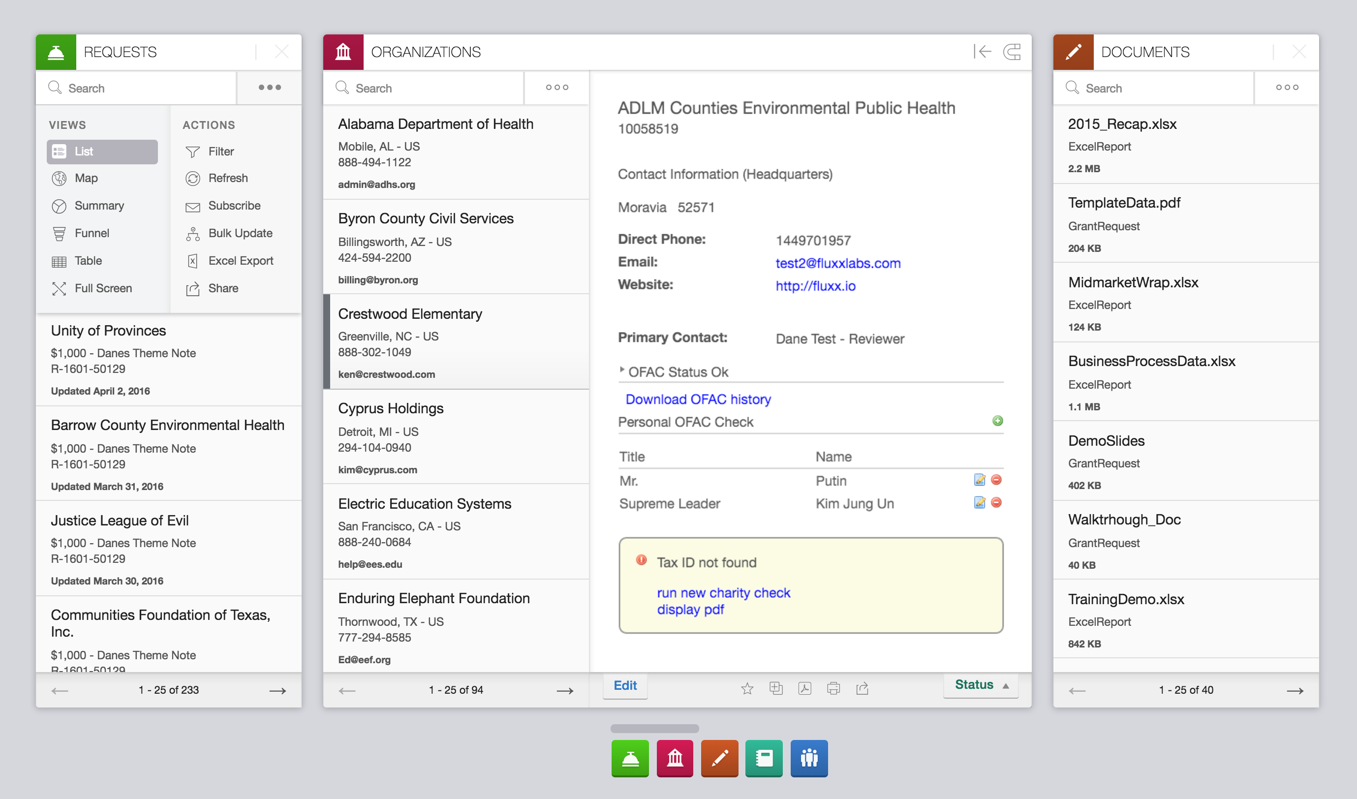
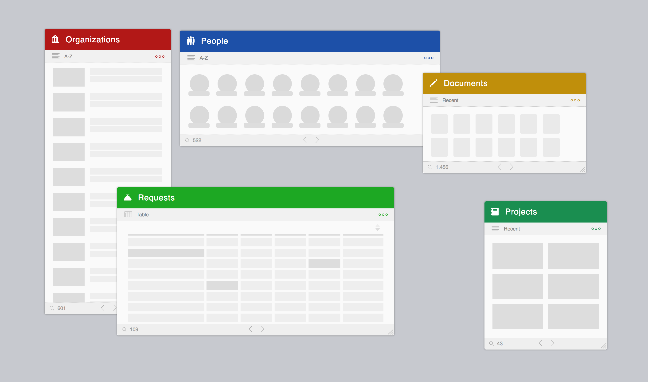
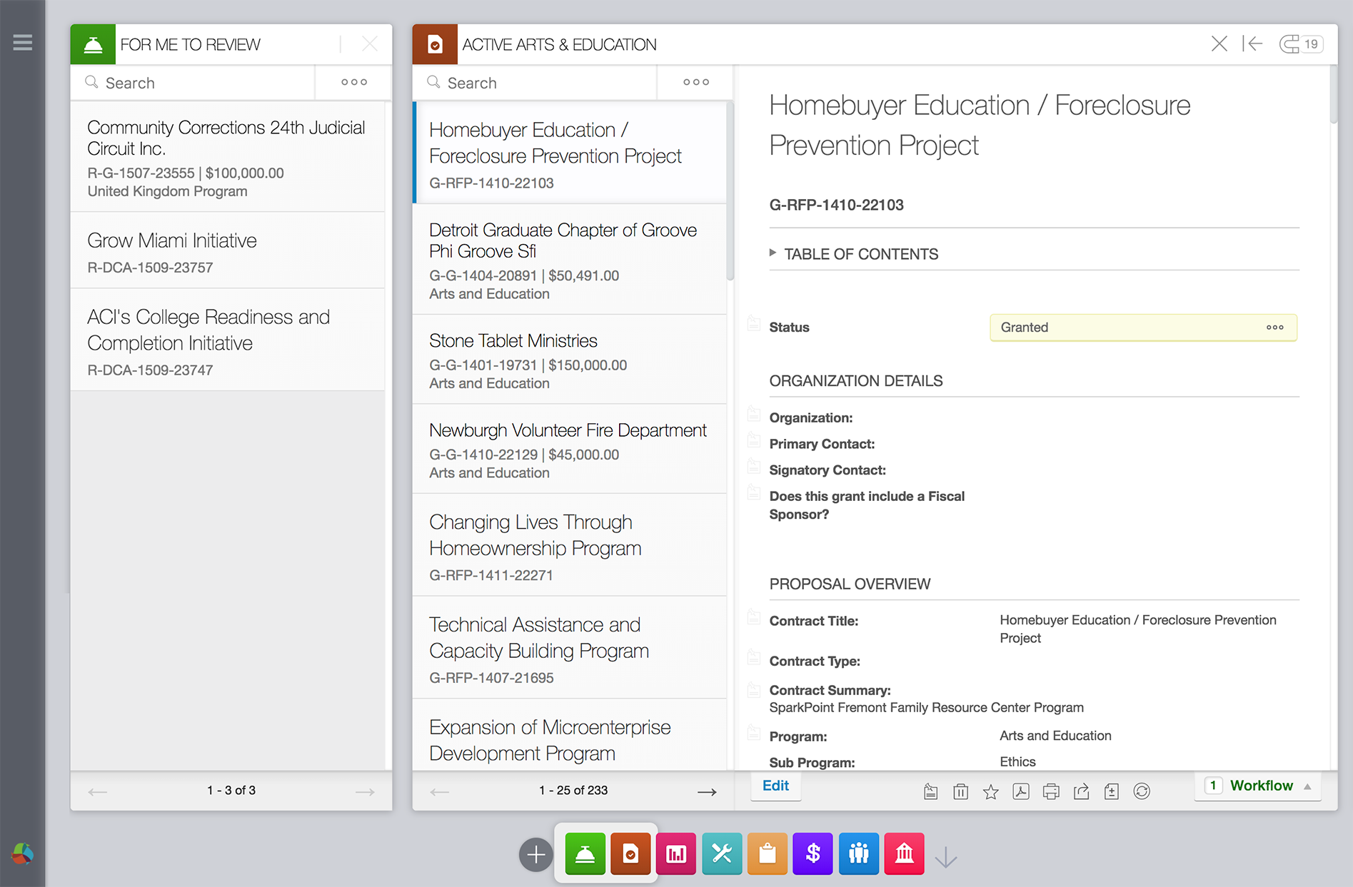
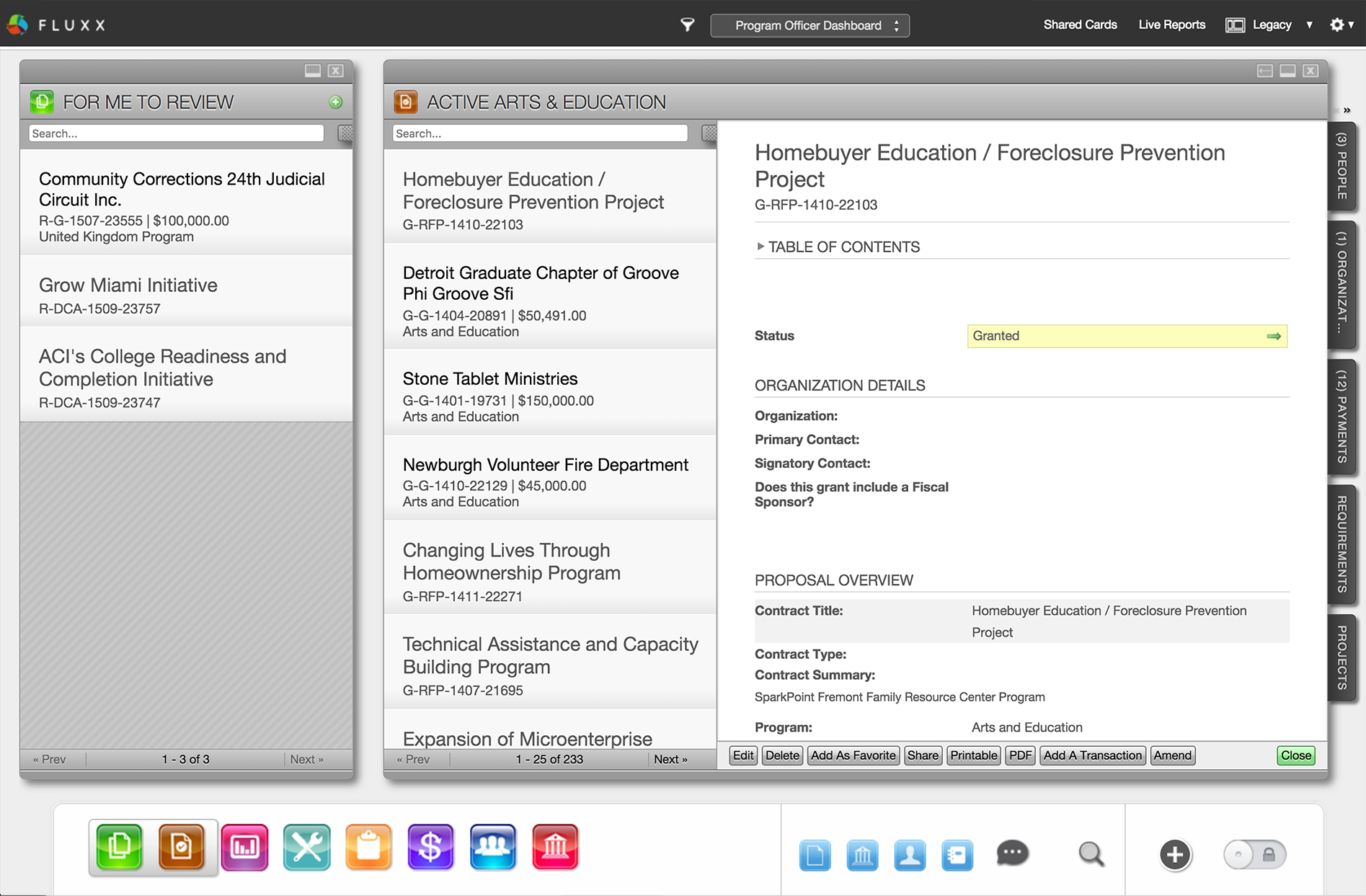
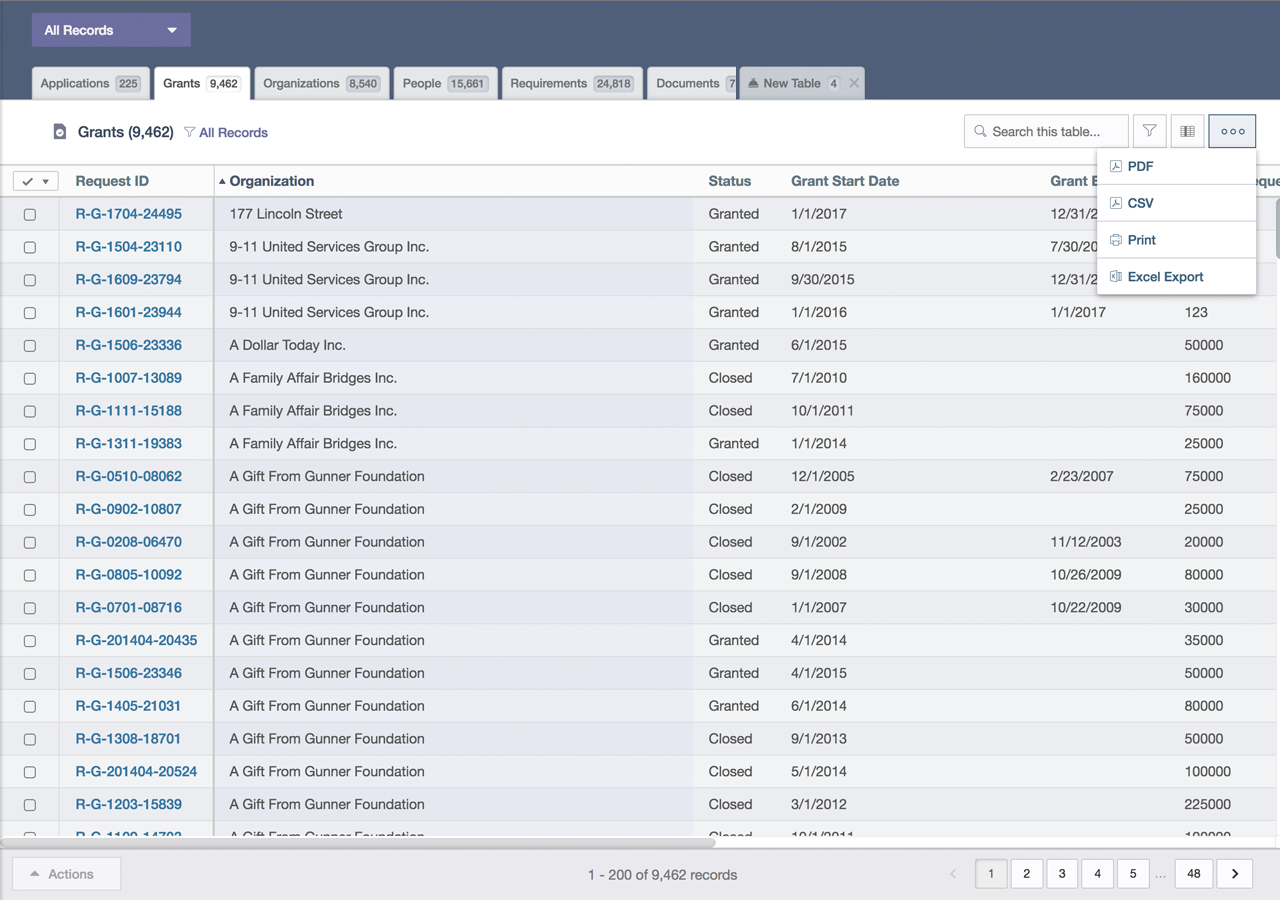
One predetermined feature was what was known as the card-based interface. This was a dashboard view of horizontally arranged cards with a mini-map of what was open on the bottom of the screen. Each card related to a model type (such as a person or document) and could be visualized using a list, graph, or table, to name a few. This metaphor was one we were asked to preserve and did so by creating alternate views, navigation, and export options for each card.
The UI was straight-forward in terms of prototyping directly in html/js which minimized handoff time and preserved much of the existing interaction. Over time, our process of creating new prototypes improved as the templates, methods, and strategy became more unified. For many features we were able to work direclty in github on the project or within our design branch.
Project Goals
The primary focus was to maintain functionality while updating the underlying design and components to expand content space, standardize forms, handle different resolutions, and guide users through predictable navigation. Over the next several months, we worked alongside engineering to define and handle hundreds of tickets related to this version of the flagship product. These were the tenets of the updated dashboard:
- Space: Simplifying the area around cards to maximize detail areas and remove redundant language.
- Components: Streamlining 100+ components to share icons, colors, and form elements.
- Resolution: Vector assets, self-hosted font files, media query breakpoints.
- Menus: Consistent interaction and labeling actions or describing them within tooltips
Thematic Preferences
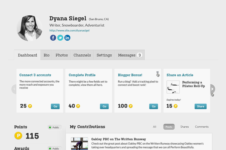
In this context, a theme was a view of a dashboard that was used for differnet purposes such as generating reports, visualizing records, or reviewing applications. This functionality allowed us to iterate alternate versions of the dashboard while maintaining parity with the existing one. It also gave the user choice in which version they preferred, making the rollout of new versions less cumbersome. This flexibility offered us room to explore usability improvements while continuing to offer legacy choices. Over time, the majority of users switched to the updated dashboard views.
Birds-Eye View
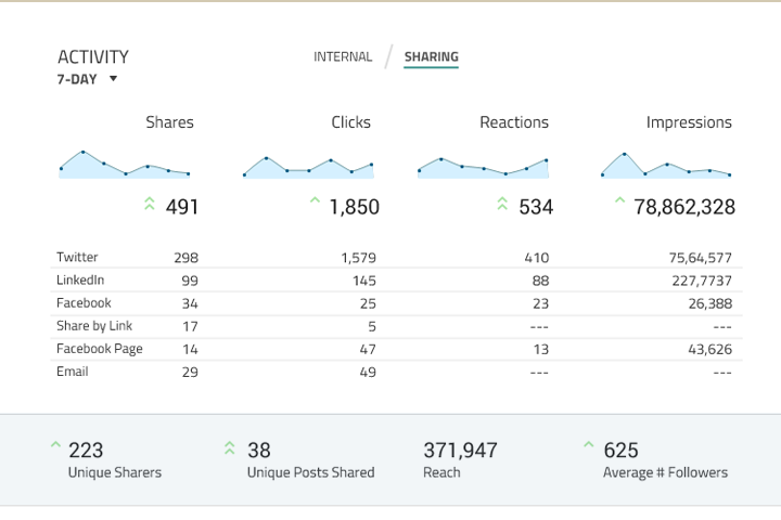
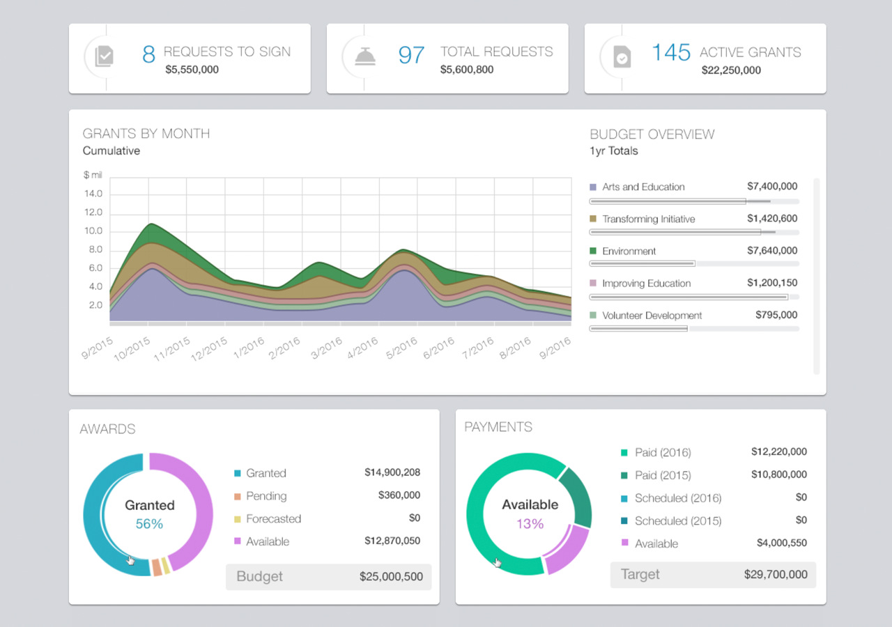
Having released a modern theme with functional parity to the existing version, we looked at how foundations could see summaries at a higher level, perhaps by an executive who isn’t managing grants on a daily basis. This led us towards visualizing large datasets, often grouping program areas, requests requiring a specific user's approval, and displaying geographic proximity and other relative comparisons. Our executive summary prototype was converted into product during a two-day engineering hackathon.
Dashboard Depth
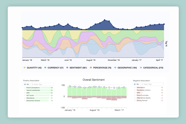
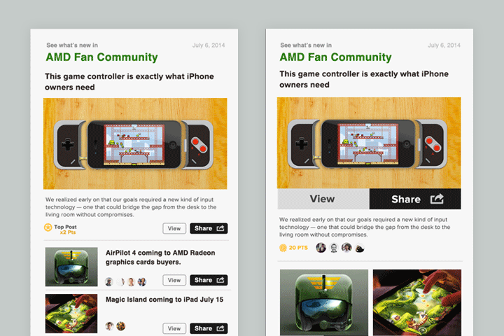
The flexible nature of the dashboard architecture allowed us to develop specific versions to serve different groups of users. One of these cohorts was focused on grantmaking at scale and their suggestions were made around automation, scheduling, and classifying data. For example, a program officer may generate a spending report by initiative each month or tag to hundreds of records for review. Reports play a significant role in grantmaking and product was developed to target goals such as these. The two screenshots captured below show a reporting builder interface along with a performance-based table view, both of which were converted into prototype prior to building into product.

Unifying Product Design
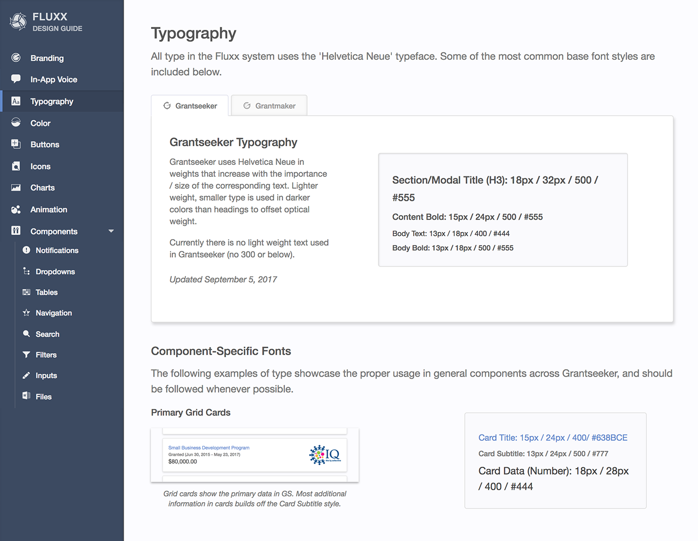
As we branched into new product use cases, it became increasingly important to streamline our design methodology. This led to hosting a repository specifically for our design system - initially used to reference icon names, color values, and component markup, it later grew to include branding, zero states, animations, and typography. This also gave our team a sandbox to test out new components and share progress remotely.

More Information
These examples showed a glimpse into how foundations used the GM platform. We also created a platform for non-profits to track their grants and manage new requests. In addition, we looked at the impact data sitting at the intersection of grant makers and grant seekers.